
Problem
EventTracker collected data on visitor behaviour, but tables and charts don’t show where on the page it happens. Customers needed to see the data right on their landing page: which elements draw attention and how far down visitors actually get.
My role
Implementing the whole frontend of the maps, including its architecture: rendering the page preview with the data on top, the heatmap and scroll layers, and the interactions with elements.
What I built
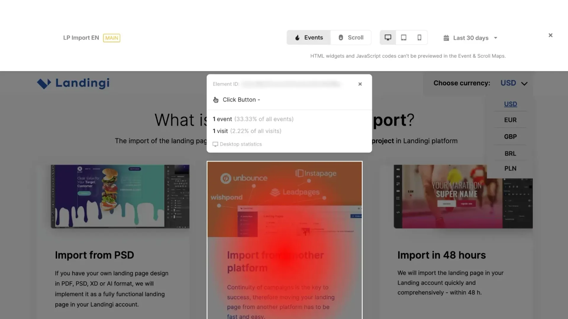
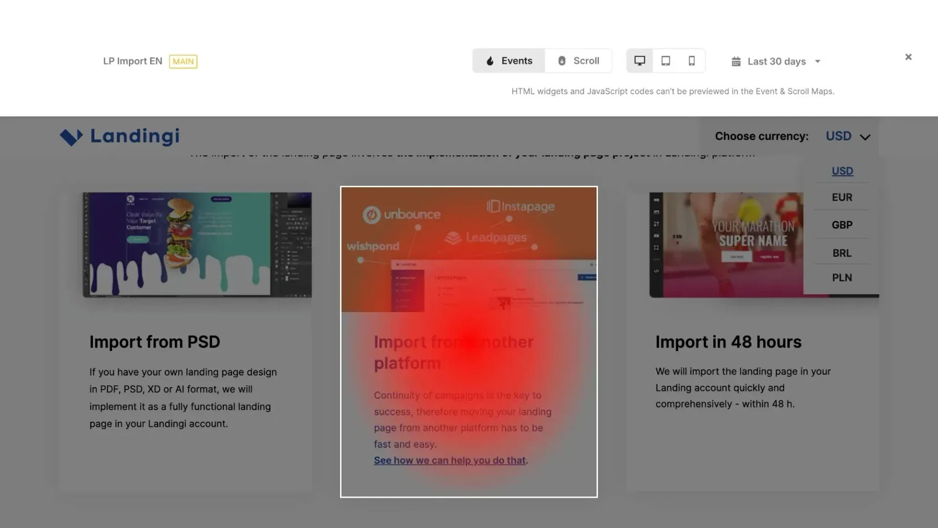
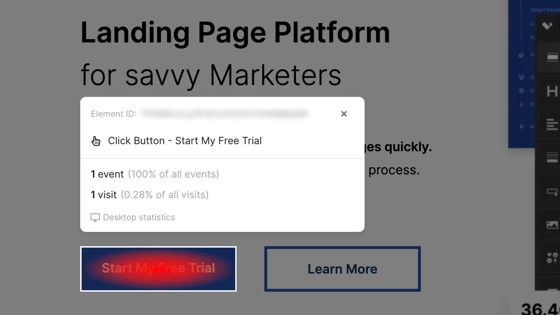
- An event map: a click heatmap laid over the page preview, with a scale from the most to the least clicked spots.
- Element details on click: the event name, the number of events and visits, and their share of the total.
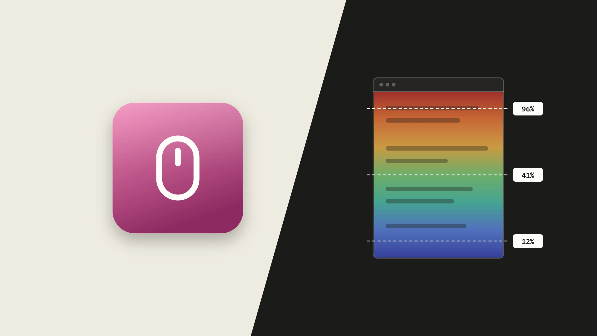
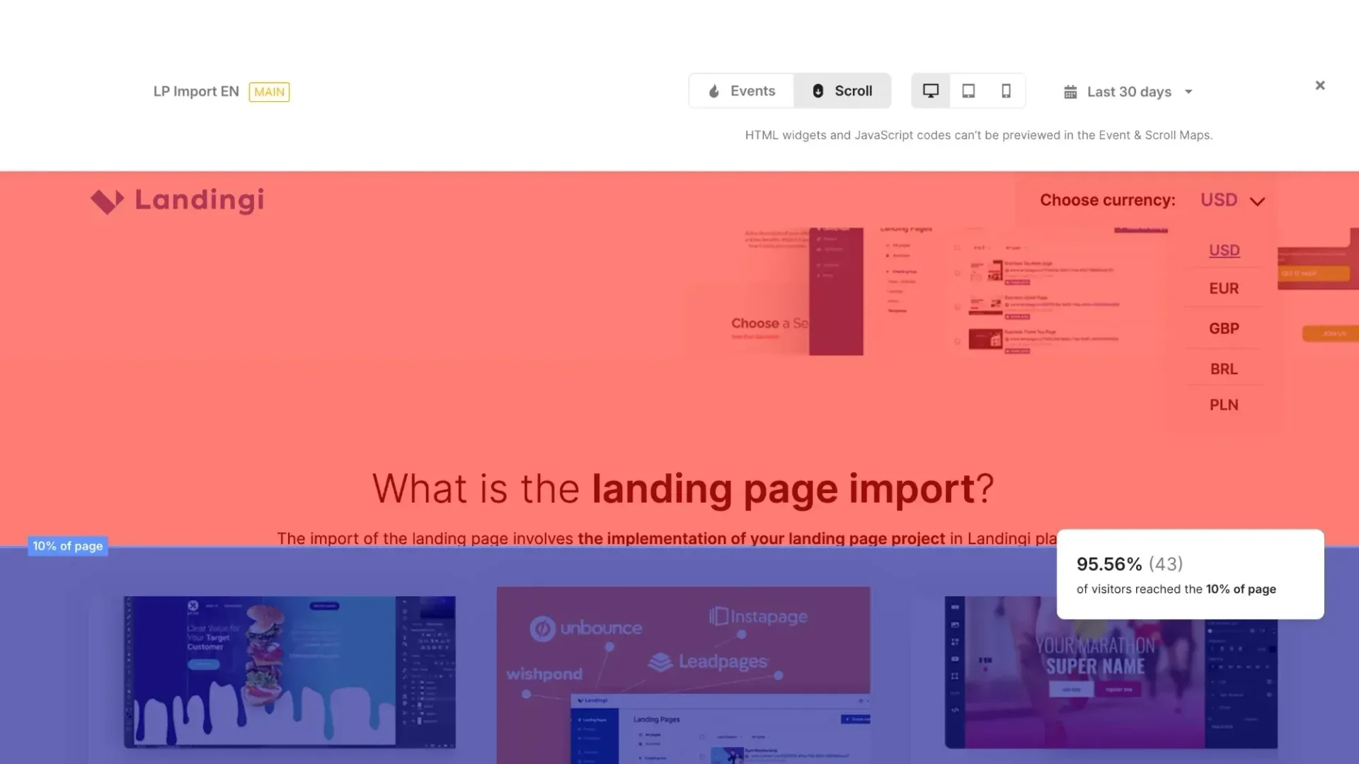
- A scroll map: bands showing what percentage of visitors reached each depth of the page.
- Switching the view between desktop, tablet and phone, and choosing the date range.
- Separate data for each page variant in A/B tests.
Challenges
01 · Data in exactly the right place
Events have to land on the right elements of the page, even though the layout changes with the screen size. Hence separate views for desktop, tablet and phone, and events tied to element IDs rather than to coordinates.
02 · A safe page preview
The customer’s page is rendered as a preview without running their scripts and HTML widgets. That way the map doesn’t depend on someone else’s code, and users know what the preview won’t show.
03 · Readable with a lot of data
The heatmap and the scroll bands have to stay smooth and readable with a few dozen visits as well as with thousands.
Outcomes
- Customers see visitor behaviour right on their own page, without external tools such as Hotjar.
- It’s easier to spot what isn’t working, such as a CTA nobody clicks or a section few visitors reach.
- Another feature built on EventTracker data.