
Problem
Getting into the platform was split across several registration variants and loosely connected screens for sign-in, verification and account recovery. The area was hard to maintain and extend, and users met slightly different behaviour at every step.
My role
Implementing the whole frontend of the new flow from the design, including its architecture.
What I built
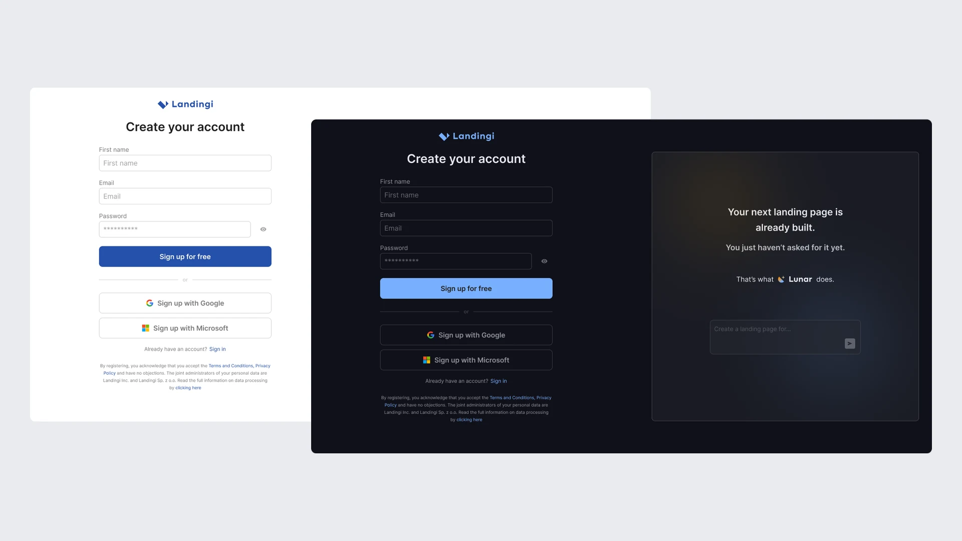
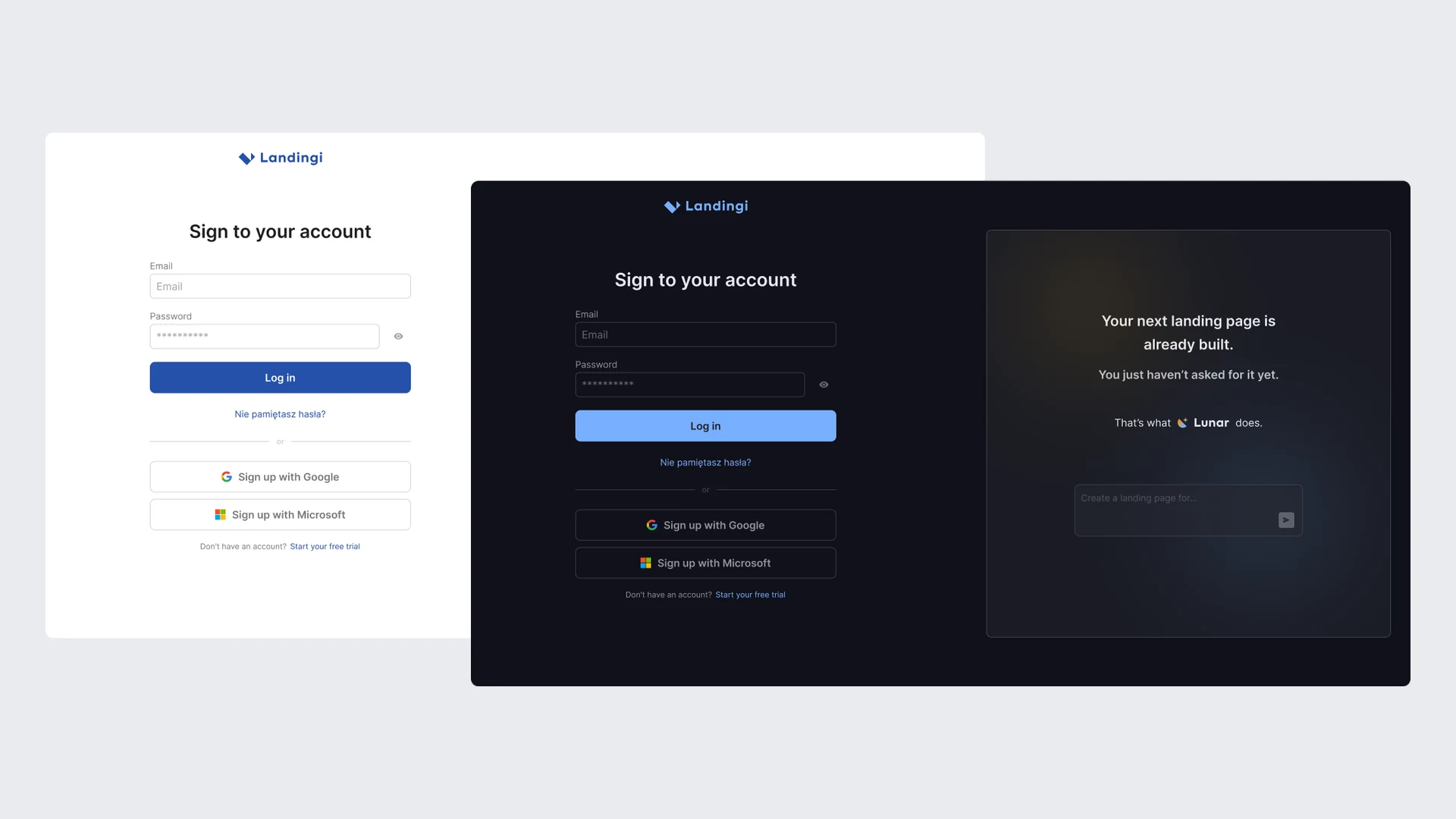
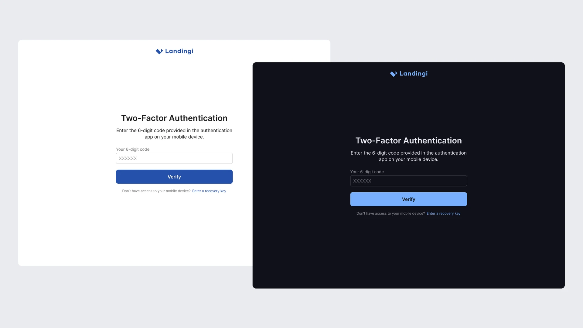
- Screens for registration, sign-in, password reset and change, email verification, 2FA and account recovery with a recovery key.
- Sign-in and registration with Google and Microsoft.
- Shared form components with one validation logic, error messages and states: loading, disabled, success and failure.
- Email verification with a code that can be sent again.
- A payment step when starting a trial.
- One- and two-column layouts, responsive behaviour and light and dark mode.
Challenges
01 · Validation
Many forms with different rules, yet the behaviour has to be the same everywhere. Rules described in Zod and wired up with React Hook Form gave one way to validate and to communicate errors. Users see requirements, such as the password rules, before they submit the form rather than only after an error.
02 · A critical spot with no room for error
Every user goes through registration and sign-in, so any bug means a lost customer or a locked account. I covered the states and edge cases with Vitest tests and agreed them with QA before release.
Outcomes
- One consistent way into the platform instead of several variants.
- Authentication screens whose code is simpler to maintain and extend.
- A flow ready for future changes to onboarding, pricing and account setup.